
Thentia Cloud is a SAAS provider for regulation and government. Faciliting and eliminating paper processes for purposes such as applications, licensing, permitting, complaints, inpections, investigations and disciplinary action.
Create a new design system, with the goal of streamlining cross-functional collaboration and enhancing overall efficiency across design, development, and product teams.
The project began with in-depth research into Thentia’s existing design practices, challenges and the needs of both designers and engineers.
The Cirrus design system included re-usable UI components, standardized interaction patterns, and a shared visual language. Our main intention was to reduce redundant coding, improve design consistency and foster smoother handoffs between design and development teams.
By integrating Cirrus into the product development lifecycle, we enabled faster prototyping, quicker iteration, and a unified design approach that improved both internal workflows and the user experience across Thentia’s platform.
Thentia being a cloud computing company and the cloud being a focal point of the company branding. We wanted to incorporate the analogy of cloud and atmospheric elements when creating the design system.
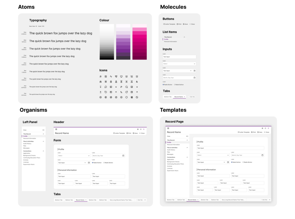
A good design system is modular because it allows for flexibility, scalability, and consistency across different products and platforms. By breaking down the system into reusable, independent components—such as buttons, forms, typography, and color schemes—it becomes much easier to update, maintain, and expand over time. If you need to make a change, whether it’s a visual update or a functional improvement, you can update a single component in the system, and it will automatically propagate across all instances where that component is used. This modular approach reduces duplication of effort, ensures consistency in design language, and makes collaboration between teams more efficient.
Furthermore, a modular design system enables teams to quickly adapt and respond to new product requirements or design challenges. For example, if a new feature or product is being built, designers and developers can pull from pre-defined, tested components to rapidly assemble the UI, rather than reinventing the wheel each time. This not only speeds up the design and development process but also ensures that all products stay aligned with the same user experience principles and brand guidelines. In essence, modularity in a design system fosters both creative flexibility and standardization making it a key element for any organization aiming for consistency and rapid iteration.
Using the Tokens Studio Plugin for Figma, I was able to sync the design tokens in the Figma file with CSS variables in Github. This takes out the guesswork for developers to pick out colors and spacing. If a color was changed in the figma file. One push to Github and the color change would also be reflected in the code.
We wanted to create the right infrastructure to eventually allow client theming and customization of Cirrus. Creating this sync between the design and the code would enable us to implement this feature at top speed in the future.
Following this youtube tutorial, I was able to implement this synchronization.
Each UI component in Figma also had linked documentation directly in Dev Mode to our UI Library in Storybook. This would allow developers to quickly find the UI code that they need linked directly from the design.